You spent three weeks researching the client’s industry. You sketched fifty terrible ideas before arriving at the perfect concept. You spent four days purely finessing the bezier curves in Adobe Illustrator until the kerning was mathematically flawless. You have solved the client's business problem perfectly.
You export the logo as a .png file, drop it into an email attachment, type "Let me know your thoughts!", and hit send.
Ten minutes later, the client replies: "Hmm. It feels a bit empty? And the font looks weird. My wife thinks it should be blue. Can we see 5 more options?"
Your heart sinks. Weeks of brilliant strategic work were just completely undone in ten seconds flat.
If this scenario sounds familiar, the problem is not your design skills. The problem is your presentation strategy.
The biggest mistake amateur designers make is assuming their work speaks for itself. It doesn't. Without context, a client is incapable of judging a logo strategically; they can only judge it subjectively (i.e., "Do I personally like this shape?").
If you want your brand identity designs to be approved on the very first round, without the dreaded "make the logo bigger" feedback loop, you must adopt a professional presentation framework. Here is the step-by-step masterclass on how to present brand designs like a world-class agency.
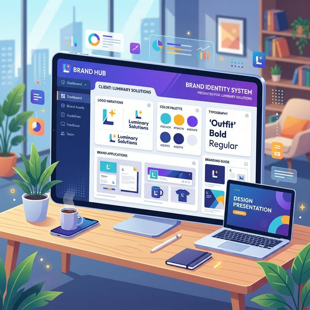
1. Never Present "Naked" Logos
A logo is an identifier, not a piece of art. It was never meant to be viewed as a massive, floating black shape on a sterile white background in the center of an email preview window.
When you present a "naked" logo, the client will immediately begin dissecting it mechanically. They will look for flaws in the negative space. They will question the thickness of the lines. They aren't looking at a brand; they are looking at a geometry puzzle.
The Solution: Contextual Mockups. You must show the client the logo living in the real world.
Instead of showing the raw vector file, your first visual should be the logo applied to high-quality, photorealistic mockups that relate directly to their business.
- If they are a coffee shop, show the logo embossed on a heavy-stock loyalty card and stamped on a burlap sack.
- If they are a tech startup, show the logo sitting cleanly in the header of a sleek iOS dark-mode app interface.
- If they are a construction firm, show the logo decaled on the side of a matte-black fleet truck.
When a client sees their brand identity applied to real-world objects, a psychological shift occurs. They stop critiquing the bezier curves and start visualizing their future success. They don't see a "file"—they see their business coming to life.
2. The Power of the "One-Concept Strategy"
For decades, the standard freelance advice was to present the client with 3 to 5 completely different logo concepts. The logic seemed sound: "Give them choices so they feel involved, and surely they will like at least one of them."
This is a disastrous strategy for two reasons:
- It sabotages your authority. By offering 5 solutions, you are essentially telling the client, "I don't actually know which one is the mathematical best for your business, so you pick." You are forcing them to act as the Creative Director.
- It creates the Frankenstein Effect. When a client is presented with Option A, Option B, and Option C, they will almost always reply: "We love the font from A, the icon from B, and the colors from C. Can you combine them?" The resulting design is always an unworkable, chaotic mess.
The Solution: Present One Strong Concept. Top-tier agencies present one single, highly refined, undeniably perfect solution.
You walk the client through the strategy of why this specific visual direction is the only logical answer to the problems established in their initial project brief. You are the expert they hired; you must make a strong, unambiguous recommendation.
(Note: Always keep a fundamentally different "Backup Concept" in your back pocket, just in case the presentation genuinely misses the mark internally, but never show it unless absolutely necessary).
3. Guide the Narrative with a Strategic Slide Deck
If you just send a link to a Dropbox folder full of images, the client will skip everything and furiously click until they find the final logo JPEG, reacting to it without any context.
You must force the client into a guided, narrative environment. Your presentation should be a curated slide deck (PDF or interactive presentation) that forces them to read the strategy before they see the logo.
A standard, high-converting Brand Presentation deck should flow exactly like this:
- The Core Problem: Remind them of the goals and friction points established in the initial discovery phase. "The goal was to appear modern and trustworthy to enterprise B2B clients..."
- The Strategic Direction: The meaning behind the visual choices you are about to show them.
- The Reveal (In Context): The logo first displayed on a beautiful, real-world mockup.
- The System Construction: Only now do you break down the logo mechanics, the typography hierarchy, and the color palette psychology.
- The Expanded Ecosystem: Show how the brand stretches across alternate layouts, patterns, and social media applications.
You are building a legal case for why your design is correct. By the time they see the raw logo construction on Slide 4, they have already agreed with the strategy on Slides 1 through 3.
4. Control the Environment: Ditch the Email Attachments
Even if you build the perfect 30-page PDF slide deck, sending it via an email attachment is incredibly risky.
Email invites chaotic feedback. The client views the PDF in their browser, gets confused, hits "Reply," and types out a stream-of-consciousness paragraph of poorly articulated feedback. Worse, they CC their entire founding team, and suddenly you are managing a 12-person "Reply All" massacre in your inbox.
To win immediate approval, you must control the digital environment in which the presentation is reviewed.
By uploading your final presentation deck to a dedicated, white-labeled client portal like TryApprove, you completely reframe the power dynamic of the review process.
- A Premium Experience: The client logs into a sleek, secure portal branded entirely with your agency's identity. It immediately commands respect.
- Distraction-Free Focus: They review the high-resolution presentation files in a beautiful, immersive gallery, rather than alongside their cluttered Gmail inbox.
- Structured Approvals, Not Conversational Revisions: TryApprove forces the client to use structured feedback tools. Instead of a chaotic email reply, they can leave contextual, point-and-click notes directly on the presentation slides.
- The Definitive Sign-Off: The entire UI of TryApprove is driving toward a singular action: The "Approve" button. When the presentation makes sense, the client clicks "Approved," locking in the milestone and triggering your final invoice. (Need to generate an invoice outside of the portal? Use our Free Freelance Invoice Generator).
Summary
Stop letting your brilliant creative work be judged in the harsh, subjective lighting of a messy email inbox.
Contextualize your designs with real-world mockups. Rely on the One-Concept strategy to maintain your authority. Build a narrative slide deck that forces agreement on strategy before subjective visual critique. And most importantly, present your work in a professional environment that demands respect.
Start presenting like a world-class agency today. Build your free TryApprove portal now.