
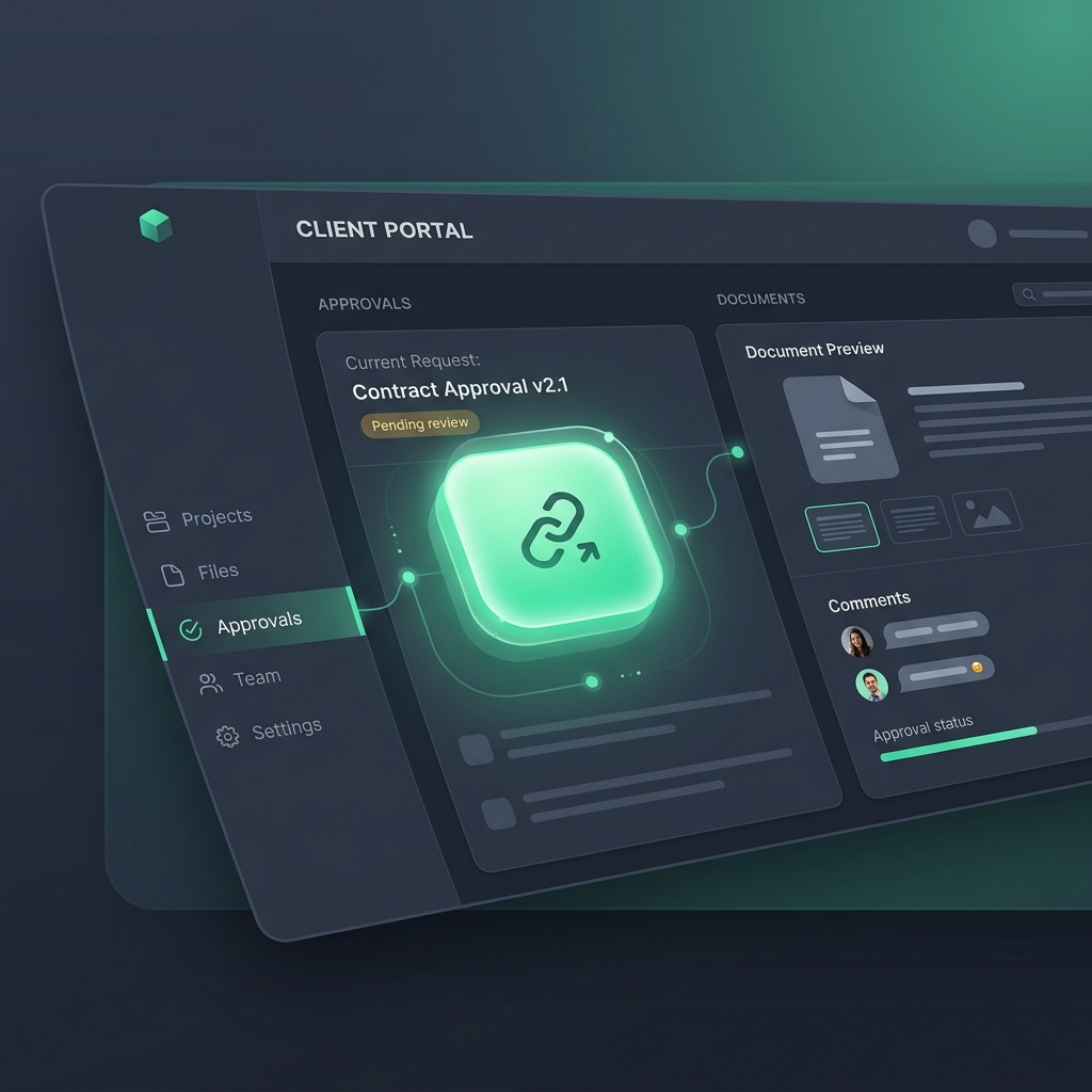
Picture this.
You spend two weeks on a brand identity package. The work is excellent — cohesive, thoughtful, perfectly aligned with the brief. You upload it to your client review platform, write a personalized message, and send the link.
Your client clicks the link on their phone between meetings. They see a login page. They don't remember their password. They tap "forgot password," get a reset email, open it, create a new password, tap "log in," and...
Actually, they don't do any of that. They close the tab. They'll "deal with it later." Later becomes tomorrow. Tomorrow becomes next week. Next week, you're writing your second follow-up email.
You lost a week. Not because the work was wrong. Not because the client didn't care. Because of a login screen.
The Friction Equation Nobody Talks About
In conversion optimization, there's a principle so fundamental it's almost embarrassing to state: every step between intent and action reduces completion rates. This is why Amazon has one-click purchasing. This is why Netflix auto-plays the next episode. This is why every consumer technology company on the planet obsesses over reducing friction.
But somehow, in the B2B agency world, we still make clients:
- Receive an email with a link
- Click the link
- Arrive at a login page
- Remember (or reset) their password
- Navigate a dashboard they use once a month
- Find the correct project
- Locate the correct deliverable
- Figure out how to leave feedback
- Write their thoughts in a text box
- Click submit
That's ten steps between "I want to review this" and "I reviewed it." Each step is a dropout point. And based on what I've seen across hundreds of agency-client interactions, roughly 40-60% of clients abandon the process before completing it — not because they don't care, but because the process is exhausting.
The math is brutal
Let's say each step has a 90% completion rate (which is generous). Over 10 steps:
0.9^10 = 0.35
That means only 35% of clients who start the review process actually finish it in a single session. The rest stop somewhere, intend to come back, and either do so days later or not at all.
Now reduce that to 3 steps:
- Click the link in the email
- See the deliverable
- Click "Approve" or "Request Changes"
0.9^3 = 0.73
You've more than doubled your completion rate just by removing steps. No better work. No better client relationship. Just fewer clicks.
Why Clients Hate Logging In (And Won't Tell You)
Here's what your clients are actually thinking but will never say out loud:
"I don't remember creating an account"
Your platform sent them a signup email three months ago. They created a password during a busy Tuesday, never wrote it down, and haven't logged in since. Now the login screen feels like a punishment for not being more organized.
"I already have too many accounts"
The average professional manages 70-100 online accounts. Your client review tool is competing for mental space with their email, their CRM, their bank, their project management tool, their kids' school portal, and the streaming service they signed up for and forgot about. Your tool is not winning that competition.
"This feels like your tool, not mine"
When a client logs into your platform and sees a dashboard with navigation menus, settings icons, and terminology they don't understand, they feel like a guest in your house. That's the wrong dynamic. The client should feel like they're being served, not onboarded.
"I'll do it on my phone... never mind"
Most clients first see your review request on their phone. Mobile login flows are terrible. Small text fields, password managers that don't trigger, two-factor auth codes that arrive late. If the first mobile experience is frustrating, the client mentally categorizes your platform as "desktop only" and waits until they're at their computer. Which might be never — or at least not today.
The Magic Link Alternative
The solution isn't building a better login page. It's eliminating the login page entirely.
Here's how magic link access works in TryApprove:
- You upload deliverables and create a review task
- TryApprove generates a unique, secure portal link for the client
- The client receives the link via email
- They click it — no login, no password, no account creation
- They see their deliverables, their project status, and their action items
- They approve, request changes, or leave visual feedback
- Done
The client never creates an account. They never set a password. They never navigate a dashboard. Their entire experience is: click a link, see the work, respond. Three steps. Under two minutes.
And because the link is unique and secure (tied to the client's email, time-limited, and encrypted), there's no security trade-off. You get the convenience of no-login access with the security of authenticated access.
What the data shows
Agencies that switched from login-required portals to magic link portals consistently report:
- Approval times drop from 3-5 days to under 24 hours. When it takes 30 seconds to approve instead of 5 minutes, clients do it immediately.
- First-response rates exceed 85%. Instead of 40-50% of clients completing review in the first session, the vast majority do it the moment they see the email.
- Follow-up emails drop by 70-80%. When the process is frictionless, you rarely need to chase. (Which means you can stop writing those awkward follow-up emails.)
- Client satisfaction scores improve. Clients genuinely appreciate not having to remember another password. It's a small thing that signals professionalism and respect for their time.
"But What About Security?"
This is the first objection every agency owner raises, and it's a good one. If there's no login, how do you prevent unauthorized access?
Magic links are actually more secure than most password-based systems for this use case. Here's why:
Passwords are the security risk
Most security breaches happen because of weak, reused, or stolen passwords. When you force a client to create a password for your review tool — a tool they use once a month — they're going to use a weak password they've used everywhere else. That's not security. That's security theater.
Magic links are scoped and time-limited
A well-implemented magic link (like TryApprove's) is:
- Tied to a specific email address. Only the intended recipient can use it.
- Encrypted. The link contains a secure token that can't be guessed or brute-forced.
- Scoped to the client's data. The link only shows that client's projects, not your entire account.
- Auditable. Every access is logged, so you know exactly who viewed what and when.
For client review and approval workflows, this is significantly more secure than a shared login that three people at the client's company might use with the same password.
Beyond Approvals: The Frictionless Client Portal
No-login access isn't just about approvals. It transforms the entire client experience.
Onboarding without the onboarding
When a new client receives their portal link, they don't need a walkthrough. There's nothing to learn. They click the link and see their contracts to sign, questionnaires to fill out, and welcome documents to review. The interface is so simple that it doesn't require instructions.
This is the difference between onboarding that feels like a product demo and onboarding that feels like a concierge experience. Your onboarding process should feel like the latter.
Branded, not generic
With white-label portals, the magic link takes clients to a page that looks like your agency — your logo, your colors, your brand. They never see your tool provider's brand. The entire experience feels like an extension of your agency, not a third-party platform.
For clients evaluating your professionalism (which they always are), this kind of cohesive, branded experience says more than a 20-slide capabilities deck ever could.
Invoicing in context
When the client's invoice appears in the same portal where they approved the work, payment feels natural. They can see exactly what they approved, connect it to the invoice amount, and pay — all without opening a separate tool, remembering a separate login, or wondering if the amount is correct.
Agencies using contextual invoicing report 30-40% faster payment times compared to standalone invoicing tools. The reason is psychological: when the invoice is next to the work, the value is self-evident.
How to Make the Switch
If you're currently using a login-required review tool, here's how to transition:
Week 1: Pilot with one client
Choose a client who's consistently slow to review. Set up their next deliverable in TryApprove instead of your current tool. Send them the magic link. Time how long it takes them to respond.
I can almost guarantee the difference will be dramatic enough to convince you to continue.
Week 2: Migrate active projects
Move your active client projects to the no-login portal. You don't need to migrate historical data — just set up new deliverables going forward. Each client gets their own branded portal link.
Week 3: Consolidate
Once approvals are in the portal, bring in onboarding (contracts, questionnaires) and invoicing. The whole point is that the client has one link that gives them everything they need — not multiple links to multiple tools.
Week 4: Measure and optimize
Track three metrics:
- Average time from deliverable upload to client response
- Number of follow-up emails needed per approval
- Average invoice payment time
Compare these to your pre-portal benchmarks. The improvement will speak for itself.
The Bigger Picture
The no-login revolution isn't just a UX trend. It's a philosophical shift in how agencies think about the client relationship.
The old model: clients adapt to your tools, learn your systems, and meet you where you work.
The new model: you meet clients where they are — in their inbox, on their phone, in the 30 seconds between meetings — and make it effortless for them to engage with your work.
The agencies that embrace this shift don't just get faster approvals. They get happier clients, smoother projects, and the kind of professional reputation that drives referrals without you asking for them.
A login screen is just a small rectangle on a screen. But what it represents — friction, complexity, disrespect for the client's time — is exactly what separates good agencies from great ones.
Remove the rectangle. Watch everything improve.
Ready to see the difference no-login access makes? Start free with TryApprove — your clients click a link and approve in seconds. No accounts, no passwords, no friction.